
Color Theory Myths That Lead to Unflattering Choices
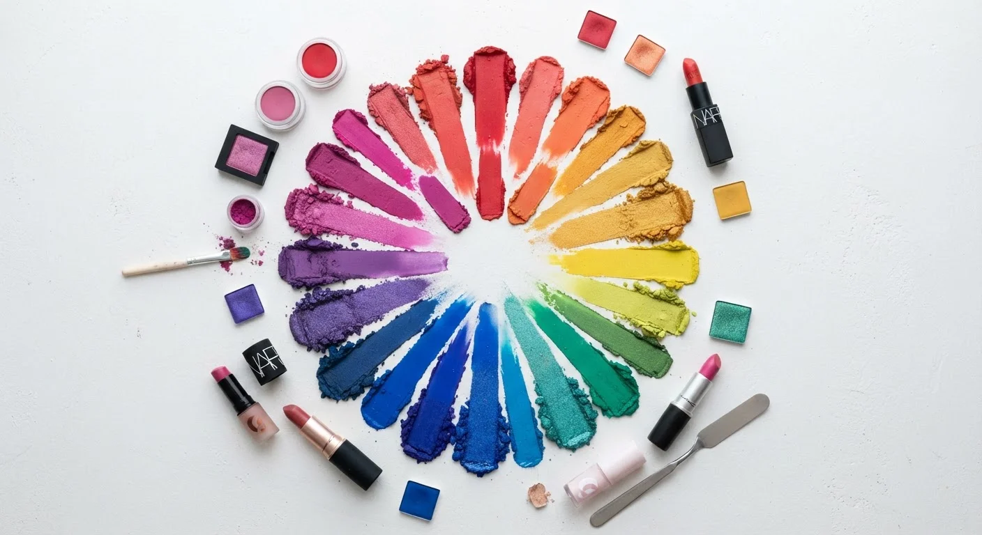
Photo credit: SmartReads.net | Simple Search, Relevant Results
In this article
From 'redheads can't wear pink' to 'neutrals suit everyone' — common color rules that don't hold up and what the evidence actually shows.
Key Takeaways
- Hair color does not restrict which clothing or makeup colors you can wear.
- Undertone - not skin depth - is the primary factor in determining flattering shades.
- Neutrals are not universally flattering; their effect depends on contrast and undertone.
- Color 'rules' are frameworks, not laws - personal contrast levels matter more than category labels.
- Wearing a color near your face has a different visual impact than wearing it on the body.
Where Color Rules Come From - and Where They Break Down
Color theory as applied to beauty has roots in legitimate perceptual science: the way hues interact with skin undertones, reflect light, and influence visual contrast is measurable and real. The problem is that decades of magazine rules and style guides distilled nuanced principles into rigid prescriptions - "redheads wear green," "warm skin wears gold" - stripping the context that made them useful in the first place.
The result is a set of widely repeated myths that cause real people to avoid entire sections of the color spectrum unnecessarily. Understanding what the evidence actually supports helps you make faster, more confident choices. For a grounding in the underlying framework, see The Color Wheel, Explained for Beauty Beginners.
Myth
Redheads can't wear pink - the colors clash and make skin look ruddy.
Fact
Pink's compatibility depends on undertone, not hair color. Cool-toned pinks often harmonize well with the cool undertones common in fair, freckled complexions.
This rule conflates hair pigment with skin undertone, which are independent variables. Many people with red hair have cool or neutral undertones in their skin, making dusty roses, mauves, and cool-leaning pinks genuinely complementary. Where warm pinks can create a ruddy appearance, the issue is a warm-on-warm clash - not a hair-color prohibition. The fix is selecting a pink that shares or complements your skin's undertone, not avoiding the hue family entirely.
Myth
Neutrals - beige, taupe, greige - are safe and flatter everyone.
Fact
Neutrals carry distinct undertones and can wash out or clash just as strongly as saturated colors when mismatched to skin undertone.
A greige with a yellow undertone reads very differently on a cool-toned complexion than on a warm one. Because neutrals are low-saturation, any mismatch with skin undertone tends to dull the face rather than create contrast - the opposite of the "safe" result people expect. True neutrals that sit cleanly between warm and cool exist but are comparatively rare in beauty formulations. Testing a neutral against your jaw in natural light is more reliable than assuming the category is automatically safe.
Myth
Dark skin tones should stick to bold, saturated colors because pastels disappear.
Fact
Pastels can read beautifully on deeper complexions when contrast and undertone alignment are considered - visibility depends on placement and formula, not pigment depth alone.
This myth misapplies the concept of contrast. Pastels do require more attention to placement - a soft lavender eye look gains definition from liner or lash contrast rather than from competing pigment - but they don't vanish on deeper skin. Highly pigmented pastel formulas developed in recent years perform consistently across a wide range of skin depths. The relevant question is whether the shade's undertone complements the skin's undertone, not whether the skin is "too dark" for soft color.
Myth
Wearing your 'best' color anywhere on your body produces the same flattering effect.
Fact
Color placement matters significantly - a shade worn at the face interacts with your complexion differently than the same shade worn on the body.
The face-framing effect is specific to colors worn at the neckline or above, where reflected light bounces directly onto the skin. A color that creates a warm, luminous reflection near the face may be entirely neutral in effect as a trouser or shoe choice. This distinction explains why color analysis consultants focus heavily on draping fabric near the face rather than assessing full outfits - and why a color you love on a bag may still not work as a scarf.
Myth
Black is universally flattering and works for every skin tone and context.
Fact
Black's contrast effect is highly dependent on individual skin depth and undertone - it can sharpen features on some and create a stark, draining effect on others.
Black is a high-contrast anchor: it reads well when there is sufficient natural contrast between your hair, skin, and features. On very fair, low-contrast complexions, black worn close to the face can overpower features rather than define them. Soft black alternatives - charcoal, deep navy, espresso - often achieve the same grounding effect without the harshness. This doesn't mean avoiding black; it means understanding when to use softened alternatives for face-adjacent placement.
What Actually Determines Whether a Color Works for You
The two variables that consistently matter most in color analysis are undertone and contrast level - not hair color, not eye color in isolation, and not the season you were assigned by a style consultant in the 1980s.
Undertone refers to the cool, warm, or neutral cast beneath your skin's surface pigment. It remains relatively stable regardless of tanning or fading and is the primary reason a color can look vibrant on one person and muddy on another with a similar surface complexion. For a science-grounded breakdown, Warm vs. Cool Undertones: What They Actually Mean for Your Skin covers exactly what these terms mean physiologically.
Contrast level - the degree of difference between your hair, skin, and eye color - determines whether you're better served by bold, high-contrast palettes or softer, more blended ones. This is the mechanism behind why some shades make a face look energized while others wash it out. Why 'Flattering' Is Really Just Color Contrast at Work unpacks that mechanism in full.
Online Color Analysis Has Real Limitations
Screen-based color analysis tools and AI-driven undertone quizzes are influenced by device calibration, lighting conditions, and photo filters - all of which distort color perception. Results from these tools should be treated as a starting point, not a definitive verdict. In-person assessment in natural light remains the most reliable method.
Seasonal color analysis - spring, summer, autumn, winter - is a useful shorthand for combining undertone and contrast, but it has real limitations when applied too rigidly. Seasonal Color Palettes: The Framework Behind the Trend explains both what the system measures and where it stops being reliable.
When reading shade labels or swatching in-store, color theory vocabulary helps enormously. Color Terms Every Beauty Lover Should Know provides a plain-language glossary, while Reading a Shade Label Without Getting Fooled applies those terms directly to decoding product formulas.
2
Key variables that actually determine color flattery
Color analysts and educators broadly agree that undertone and contrast level are the two most reliable predictors of whether a color suits a person.
4
Seasonal color categories in classic analysis
The seasonal system - spring, summer, autumn, winter - was developed in the mid-20th century and remains a widely used framework, though experts note it oversimplifies the full spectrum of undertone combinations.

Author
Beauty Editorial Team
Beauty Editorial Team is the collective byline for our editorial team and contributor network. Articles published under this byline or an editorial pen name are researched, written, and reviewed according to our editorial standards for clarity, consistency, and independence before publication.
View all articles →