
Color Terms Every Beauty Lover Should Know
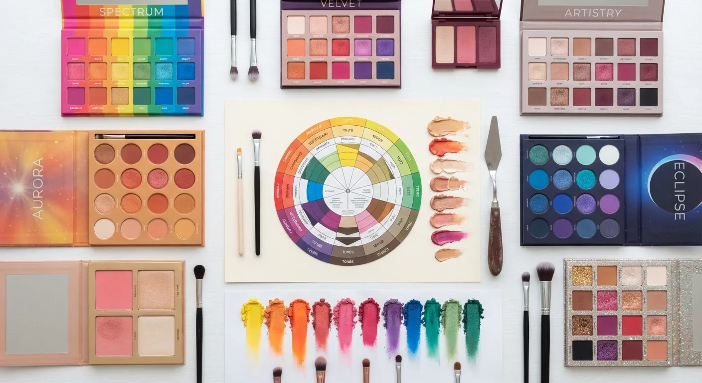
Photo credit: SmartReads.net | Simple Search, Relevant Results
Hue, saturation, value, chroma — a plain-language glossary of color theory vocabulary as it applies to makeup, hair, and style decisions.
Why Color Vocabulary Matters in Beauty
Walk into any beauty counter or scroll through a shade-finder tool and you'll encounter words like warm undertone, muted chroma, or cool-toned neutral - used confidently, defined rarely. That gap between language and understanding costs people real money in wrong purchases and missed opportunities to wear colors that genuinely work for them.
Color theory isn't just an art-school concept. Its vocabulary maps directly onto every decision in your beauty routine: which foundation reads natural on your skin, why a particular lipstick makes your eyes pop, or why two products labeled "nude" look nothing alike. Mastering the terms below gives you a framework, not a rulebook. See our color wheel guide for beginners for a visual companion to these definitions.
Hue
The pure color family - red, blue, yellow, green, and so on - before any lightness or saturation is applied. In beauty, hue is the starting identity of a shade: whether a blush is fundamentally pink, peach, or coral.
Value
How light or dark a color is on a scale from white to black, independent of its hue. In makeup, value is what separates a deep berry lip from a pale blush-pink one, even if both share the same underlying hue.
Saturation
The intensity or purity of a color - how much gray has been mixed in. Highly saturated colors appear vivid; desaturated colors appear muted or dusty. The term is often used interchangeably with chroma, though they differ technically.
Chroma
A measure of colorfulness relative to a neutral gray of the same value. High chroma means a color is vivid and eye-catching; low chroma means it reads soft, muted, or earthy. Chroma is what distinguishes a bold pigment from a sheer wash of the same hue.
Undertone
The subtle, underlying cast that sits beneath the surface of a color or skin tone - typically categorized as warm (yellow, peach, gold), cool (pink, red, blue), or neutral. Undertone is one of the most critical variables in foundation and concealer matching.
Tone
A color created by mixing a pure hue with gray. In hair coloring, 'tone' also refers to the cool, warm, or neutral quality applied after lightening to neutralize unwanted brassiness or achieve a specific finish.
Tint
A color made by adding white to a pure hue, reducing its depth without changing its hue identity. Pastel shades are tints. In beauty, tinted formulas (like tinted moisturizers) add a sheer wash of color without full coverage.
Shade
A color made by adding black to a pure hue, deepening it while retaining its identity. In everyday beauty language, 'shade' is used loosely to mean any color variant - but the technical meaning is specific to darkened hues.
Warm vs. Cool
A spectrum describing whether a color leans toward yellow-orange-red (warm) or blue-violet-green (cool). This distinction applies to both products and skin tones, and matching or intentionally contrasting them is a foundational technique in color coordination.
Complementary Colors
Hues positioned directly opposite each other on the color wheel. When placed side by side, complementary colors intensify each other visually. In makeup, this principle explains why purple eyeshadow makes brown eyes appear more vivid.
Neutral
In color theory, a true neutral is a color without hue - white, gray, or black. In beauty marketing, 'neutral' often means low-saturation or skin-adjacent tones, which still carry a warm or cool bias and are not truly hue-free.
Color Temperature
A way of describing whether a light source or color reads as warm (amber, yellow) or cool (blue, white). Lighting temperature affects how makeup colors appear in photographs and in different environments - a foundation that looks perfect in-store can shift under natural daylight.
Putting the Terms to Work
Knowing the definitions is only useful when you can apply them. Here's how the core vocabulary plays out across common beauty decisions.
| Core color dimensions | Hue, Value, Chroma (the Munsell system axes) (Munsell Color Science Laboratory) |
| Undertone categories | Warm, Cool, Neutral (Standard beauty industry classification) |
| Complementary pair example | Blue-violet shadow intensifies brown eyes (Derived from RYB color wheel relationships) |
| Chroma effect on wearability | Lower chroma = more versatile; higher chroma = more statement (Applied color theory, general principle) |
| Value's role in contouring | Darker values recede; lighter values advance (Foundational light-and-shadow principle) |
Foundation and concealer: The most common mismatch happens at the undertone level, not the depth level. A product may match your value (lightness) perfectly but pull pink, yellow, or gray depending on its dominant undertone. Train yourself to assess undertone separately from shade depth.
Lipstick and lip liner: Chroma is the variable that determines whether a lip color reads bold or wearable. A high-chroma red is a statement; a low-chroma version of the same hue reads muted and daytime-appropriate. Neither is wrong - they serve different purposes.
Eyeshadow and contour: Value contrast does the heavy lifting in eye and face sculpting. Deeper values recede visually; lighter values advance. This is the mechanic behind every contouring and highlighting technique.
Hair color: Tone, level, and warmth are the three axes colorists work on simultaneously. Level maps to value; tone maps to hue; warmth maps to the warm-cool axis within that hue. When a hair color looks "off," one of these three is usually the culprit. For a closer look at how misleading shade names obscure these variables, see how to decode shade labels.
One important note: color perception is also influenced by lighting conditions, screen calibration, and individual variation in color vision. Descriptions like "warm" or "cool" are useful guides, not universal facts. If you've ever wondered why certain shades make you look vibrant while others wash you out, contrast science explains it more precisely than most beauty rules do. And before accepting common color "rules" at face value, it's worth reviewing color theory myths that lead to unflattering choices - many widely repeated guidelines don't hold up under scrutiny.

Author
Beauty Editorial Team
Beauty Editorial Team is the collective byline for our editorial team and contributor network. Articles published under this byline or an editorial pen name are researched, written, and reviewed according to our editorial standards for clarity, consistency, and independence before publication.
View all articles →