
Reading a Shade Label Without Getting Fooled
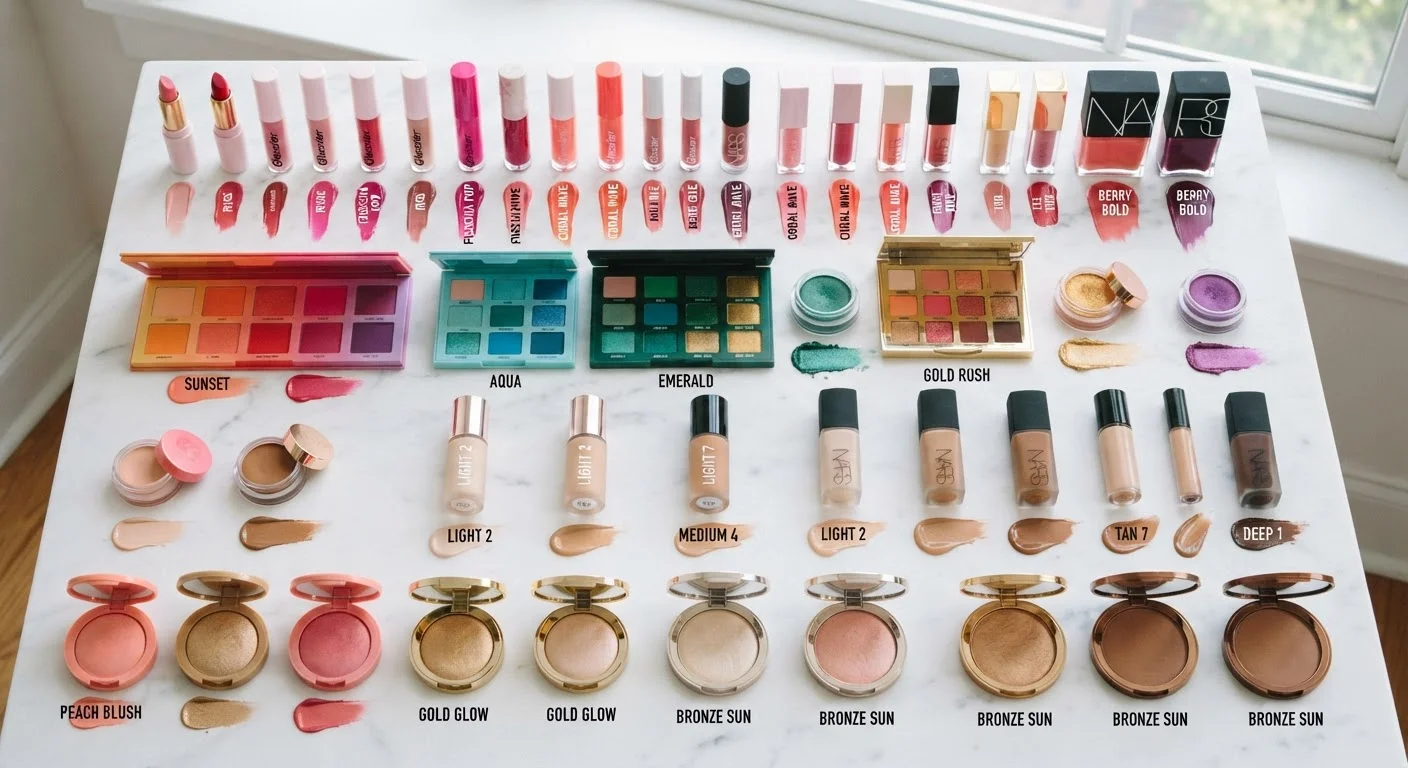
Photo credit: SmartReads.net | Simple Search, Relevant Results
In this article
Shade names in beauty are notoriously misleading. Color theory gives you a framework to decode what's actually in the formula before you commit.
Key Takeaways
- Shade names are marketing language - undertone, value, and saturation reveal what a color actually does.
- Warm, cool, and neutral undertones are the most critical variable when predicting how a shade performs on skin.
- Saturation level determines whether a shade reads bold or wearable, regardless of its poetic name.
- Swatching on your inner wrist or jawline gives more reliable data than tube or pan color.
- Color theory fluency helps you shop faster and return less, even online.
Why Shade Names Are Designed to Seduce, Not Inform
"Dusty Rose Reverie." "Cognac Dream." "Sandstone Noir." These names sell a feeling - they are not color descriptions. Marketing language in the beauty industry prioritizes emotional resonance over technical accuracy, which means two products named nearly identically can look completely different on skin. Understanding this gap is the first step toward shopping smarter.
Color theory gives you a reliable vocabulary where marketing copy does not. Instead of relying on a name, you learn to evaluate three objective properties of any shade: hue (the base color family), value (how light or dark it is), and saturation (how vivid or muted it appears). Together, these three coordinates describe exactly what a color is doing - and predict how it will interact with your skin tone, hair color, and the other shades you wear. For a deeper look at how contrast drives those interactions, see why flattering is really just color contrast at work.
Treat Every Shade Like a Coordinate
Rather than asking "do I like this color?", train yourself to ask: what is its hue family, value, saturation, and undertone? This four-part check takes under a minute once it becomes habit and gives you far more predictive power than any shade name. It also makes online shopping significantly less risky.
What the Label Won't Tell You (and How to Find It)
Most shade labels omit the single most predictive piece of information: undertone. Undertone refers to the subtle warm, cool, or neutral cast embedded within a color - and it determines whether a shade harmonizes with or fights against your skin's own undertone. A nude lipstick with a pink-cool undertone can look ashy on warm-toned skin; the same value and saturation in a peachy-warm version reads seamlessly natural.
Here is how to decode undertone from what is available to you:
- Ingredient-level pigments: Warm shades typically contain yellow, orange, or red pigment bases (iron oxides, yellow ultramarines). Cool shades lean on pink, purple, or blue pigment families. Neutral shades blend both.
- Shade name adjectives: Words like "peach," "bronze," "honey," and "terracotta" signal warmth. "Plum," "ash," "slate," and "mauve" signal cool or neutral territory. These cues are imprecise but directional.
- Swatch images: When shopping online, filter for swatch photos taken in natural daylight on a range of skin tones - artificial retail lighting skews cool and flattens saturation.
Seasonal color analysis frameworks use a similar undertone logic; learn the theory behind seasonal palettes if you want a structured approach to finding your undertone family.
Don't Trust Packaging Color as a Reference
The color of the packaging, cap, or label insert is often chosen for branding reasons and may not accurately reflect the product shade inside. Always seek out an actual formula swatch - on skin, on a swatch card, or in a reliable photograph taken in natural light - before drawing conclusions about how a shade will perform.
Step-by-Step: Decoding Any Shade Before You Commit
What you will need
Identify the hue family first
Strip the name away entirely. Look at the swatch or product and ask: is this primarily red, orange, yellow, green, blue, violet, or a neutral (brown, gray, white, black)? Anchor your analysis in the actual color family, not the label's story.
Determine the value (light to dark)
Squint at the swatch. Value - lightness or darkness - is easier to perceive when you reduce the detail. Place the shade on a mental scale from 1 (white) to 10 (black). Mid-values (4-6) are generally the most forgiving across a range of skin tones and lighting conditions.
Assess the saturation level
Saturation describes the color's intensity - how vivid versus how muted it appears. A fully saturated shade is pure and bold; a desaturated version of the same hue looks dusty, smoky, or earthy. Muted saturation is typically more wearable for everyday contexts; high saturation reads as statement or editorial.
Detect the undertone
Using the adjective and pigment cues from the section above, classify the shade as warm, cool, or neutral. Then compare it to your own skin undertone. Matching undertones creates harmony; deliberate contrast (a cool shade on warm skin) can work as an artistic choice but requires intention.
Swatch on skin - in the right place and light
For lip and blush shades, swatch on your inner wrist where skin is thinner and less sun-altered. For foundation and concealer, swatch along your jawline. Always evaluate in natural daylight or a daylight-balanced light source. Give the swatch 30 seconds to oxidize - some formulas shift noticeably after initial application.
Common Shade-Label Traps and How to Avoid Them
Even with a solid color theory framework, certain label conventions are reliably misleading. Watch for these patterns:
- "Nude" and "natural"
- These terms are relative to an implied baseline skin tone that is rarely stated. Always check the undertone and value before assuming a nude will read that way on your skin.
- "Universal" or "for all skin tones"
- Truly universal formulas exist, but the claim alone is not evidence. Evaluate the saturation: highly saturated shades are far less universally flattering than low-saturation, mid-value options.
- Color family drift
- A "red" lipstick might be blue-red (cool), orange-red (warm), or true red (neutral). These perform very differently. Identify the secondary hue before assuming one red will substitute for another.
For a broader look at which color rules to trust and which to discard entirely, color theory myths that lead to unflattering choices is a useful companion read.
This article is for informational and educational purposes only. Individual results vary based on skin tone, formula, and application technique.

Author
Beauty Editorial Team
Beauty Editorial Team is the collective byline for our editorial team and contributor network. Articles published under this byline or an editorial pen name are researched, written, and reviewed according to our editorial standards for clarity, consistency, and independence before publication.
View all articles →