
The Color Wheel, Explained for Beauty Beginners
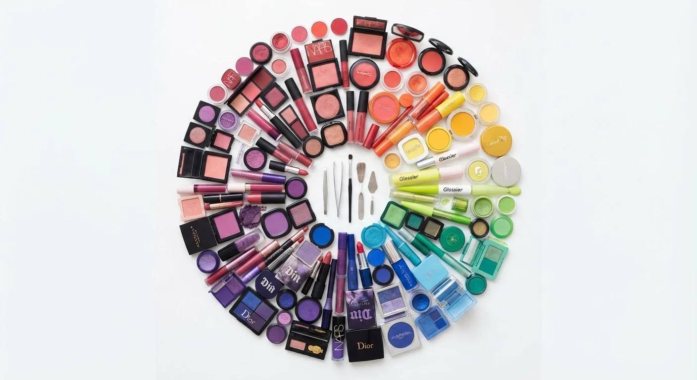
Photo credit: SmartReads.net | Simple Search, Relevant Results
In this article
Understand the color wheel and how its relationships — complementary, analogous, triadic — translate directly into flattering beauty choices.
Key Takeaways
- The color wheel organizes hues into predictable relationships that can guide beauty decisions.
- Complementary colors sit opposite each other and create the most visual contrast when paired.
- Analogous colors sit side by side and produce harmonious, blended effects.
- Warm and cool undertones on the wheel map directly to skin tone flattery.
- You don't need to memorize theory - understanding a few core principles is enough to shop and apply color confidently.
What the Color Wheel Actually Is
The color wheel is a circular diagram that organizes visible hues - from red through orange, yellow, green, blue, and violet - into a sequence that mirrors how colors relate to each other. It was formalized by Sir Isaac Newton in 1666 when he bent white light through a prism and arranged the resulting spectrum into a loop. Artists and designers have refined it ever since.
At its foundation, the wheel distinguishes three tiers of color:
- Primary colors - red, yellow, and blue - cannot be mixed from other hues.
- Secondary colors - orange, green, and violet - are produced by combining two primaries.
- Tertiary colors - such as red-orange or blue-green - sit between primary and secondary hues, created by mixing adjacent colors.
For beauty purposes, you don't need to memorize every position. What matters is that the wheel is a map of relationships. Once you understand how hues are positioned relative to each other, color decisions become logical rather than guesswork. See our plain-language glossary of color terms to get comfortable with vocabulary like hue, saturation, and chroma before going further.
Hue
The pure, base color itself - red, blue, yellow - before any lightening, darkening, or muting is applied.
Complementary colors
Two colors positioned directly opposite each other on the color wheel that create strong visual contrast when placed side by side.
Analogous colors
A group of colors that sit next to each other on the wheel; they share similar underlying tones and blend harmoniously.
Undertone
A subtle warm, cool, or neutral cast beneath the surface of a color - or skin - that influences how it reads in different contexts.
Saturation
The intensity or vividness of a color. A highly saturated red is vivid and bright; a low-saturation red reads as muted or dusty.
Triadic
A set of three colors spaced evenly around the color wheel, offering variety and balance when used together in a look.
The Three Key Color Relationships
Three spatial relationships on the wheel are the most useful for everyday beauty decisions:
Complementary
Colors directly opposite each other on the wheel - such as blue and orange, or purple and yellow - are complements. When paired, they amplify each other's intensity through contrast. This is why a copper bronze eyeshadow makes blue eyes appear brighter: the opposing hues create maximum visual tension. Color contrast is the underlying mechanism behind what we call 'flattering' - and complements are its most powerful expression.
Analogous
Colors that sit adjacent on the wheel - like red, red-orange, and orange - are analogous. They share an underlying hue, so they blend seamlessly. An analogous eye-to-lip look (say, a terracotta lid with a coral lip) feels cohesive rather than jarring, making it a reliable choice when you want a polished result without much effort.
Triadic
Three colors spaced equally around the wheel form a triadic set - for example, red, yellow, and blue. This relationship introduces variety while maintaining balance. In beauty, triadic combinations tend to read as creative and bold. They reward deliberate editing: use one color as the dominant note and the other two as accents rather than applying all three equally.
Start with one relationship at a time
Rather than trying to apply all three color relationships at once, pick one per look. Begin with complementary pairing - find your eye color's opposite on the wheel and try a shadow in that range. Once that feels intuitive, experiment with analogous looks. Building fluency in stages is more effective than attempting to master everything simultaneously.
Warm vs. Cool: Why It Matters for Your Complexion
The wheel is divided into a warm half (reds, oranges, yellows) and a cool half (blues, greens, purples). Skin tones carry their own warm, cool, or neutral undertone - and this is where the wheel becomes genuinely personal.
A warm undertone in your skin tends to harmonize with warm-half hues, while cool undertones often sit well alongside cooler shades. But the relationship isn't rigid. High contrast can work just as powerfully as harmony - someone with a cool complexion wearing a bold warm-toned lip may look striking precisely because the contrast is intentional.
The more nuanced insight is that nearly every color on the wheel comes in a warm and a cool version. Red can read orange-leaning (warm) or blue-leaning (cool). Choosing the right version of a color for your undertone often matters more than avoiding entire color families. This is a key reason why blanket color rules like 'redheads can't wear pink' don't hold up under scrutiny.
Undertone Is Personal, Not Universal
General guidance about warm and cool tones is a starting point, not a prescription. Individual complexions vary significantly, and factors like lighting and finish (matte vs. luminous) also affect how a color reads. If you're unsure of your undertone, testing shades in natural daylight on your jawline is a more reliable method than relying on category labels alone. This article provides general educational information, not personalized beauty advice.
Putting Color Theory to Work in Your Routine
Theory is only useful when it changes how you act. Here are four concrete ways to apply the wheel:
- Identify your eye color's complement. Locate your eye color on the wheel, then look directly opposite. Shadows in that range will make your eyes appear more vivid.
- Build monochromatic looks with analogous hues. Select a single color family - warm pinks, for example - and vary saturation and depth across your eye, cheek, and lip. The analogous structure keeps everything unified.
- Use color to correct, not just decorate. Color-correcting primers work on complementary logic: a green-tinted product neutralizes redness because green and red are complements that cancel each other out.
- Read shade labels with the wheel in mind. A product described as 'nude' may pull warm or cool depending on its undertone. The wheel gives you a framework to predict how it will actually read on your skin. Our guide on decoding shade labels goes deeper into this.
As you build confidence here, seasonal color analysis offers a more personalized framework that extends these principles to your full wardrobe and beauty palette.
Color Terms Every Beauty Lover Should Know
A plain-language glossary covering hue, saturation, value, and chroma as they apply to makeup and hair decisions - essential reading before diving deeper into color theory.
Seasonal Color Palettes: The Framework Behind the Trend
Explains the theoretical foundation of seasonal color analysis - what it actually measures, how it connects to the color wheel, and where its limitations lie.
Frequently Asked Questions

Author
Beauty Editorial Team
Beauty Editorial Team is the collective byline for our editorial team and contributor network. Articles published under this byline or an editorial pen name are researched, written, and reviewed according to our editorial standards for clarity, consistency, and independence before publication.
View all articles →